Thanks to ButtonMashing.com, I found Gaming While Color Blind, a post at the Amazon Game Room’s blog. The author talked about the problems he had playing the beta for Battlefield: Bad Company:
Starting out by the blue people, I saw a green guy, and shot him… minus 10 points for killing a team member. I re-spawned and move out again. There’s a green guy. I won’t shoot him this time… oh, he shot me. Eventually I became hesitant to shoot as I didn’t want to be a team-killer. Instead I wandered the fringes playing with the destructible environment. Taking out half a building is great fun. Not knowing who to shoot isn’t.
Eventually I realized there were blue, green, AND red people in the game. *sigh* Green and blue guys are teammates. Red guys are enemies. That seems simple enough, except that I couldn’t tell the green guys from the red guys.
When it comes to the game interface, we try to make things as intuitive as possible. One way to make it obvious that two objects on a screen are different is by using different colors. In fact, I remember going to a Chicago IGDA meeting in 2003 to see John Tobias (of Mortal Kombat fame) give a talk on character design. He said that when he works on character design, he always applies the concepts of shape, size, and color to differentiate characters and objects.
When you’ve locked the shape and size of various objects, such as orbs in a puzzle game or soldiers in an FPS, the other option you have is color. But as Osver points out, color might not be enough for a significant percentage of your players, especially if you pick colors without considering their impact on the color blind. My beta testing for Killer Kittens has uncovered a number of problems, and one of them was the color scheme I used. Currently I have a blue ship on a green background, and as far as I am concerned, it is very easy to see the player’s ship, but I’ve had players complain that the “blue-on-blue” scheme is hard to see. GameProducer.net also documented a problem that a color blind player had during a demo.
What can you do? One tool you can use is this Color Scheme Generator. While it is aimed at web developers to help them pick a good color scheme for the Web, it can also be used to give you an idea what kinds of problems color blind players of your games may have. There is a drop-down menu at the bottom that lets you see the difference between normal vision and any of the various forms of color blindness.
Another option is to actually change how your objects look. Rather than have the same image with a different color, add something unique to each. The version of Frozen Bubble on this site allows for you to toggle “colorblind mode” with a key press. Notice the difference between these two images:
Whether you are color blind or not, you can play Frozen Bubble. As I understand it, the history of this feature came about because a few color blind players really wanted to play Frozen Bubble, and they were able to talk with the developers and add a feature that would allow them to do so.
Snood got around this problem entirely by having different shapes as well as colors. Even if you couldn’t tell the snoods apart by their colors, they had unique faces which made it easy to do so.
One nice side effect of making your game accessible to color blind players is that it also makes it more accessible to everyone. Perhaps one of your players has a monitor that doesn’t display colors quite the way it should. Your game can still entertain that player if your design makes use of more than color as a differentiator.
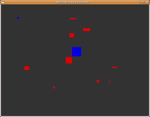
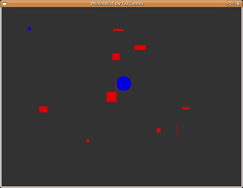
Another example is my Ludum Dare #11 entry , which involves moving your mouse to the goal while avoiding the randomly shaped obstacles. The goal and your mouse cursor are the same color, and the obstacles are a different color. I picked blue for the mouse and goal, and red for the obstacles. Even if you have some form of color blindness, you should be able to see the difference.
Now, just in case, I could also improve upon this design by making use of shapes. Since the obstacles are going to be randomly sized rectangles, I could make the goal a circle to differentiate it better.
I could even use a very detailed sprite to help differentiate it from the solid colors of the obstacles. There are quite a few options, but the point is that by taking into account the fact that some people are color blind, you could make your game more accessible, which means more people can play it. By ignoring this issue, you are putting up artificial barriers that prevent a significant number of people from enjoying your game.
[tags] video games, video game development, color blind, graphic design, character design [/tags]


2 replies on “Game Design for the Color Blind Player”
Accessibility is an important part of making something, whether is be a game, or a tool, or anything else. It’s easy to ignore something like color blindness unless you’ve got it, or you know someone who has it. Something else to consider (though, this usually applies to commercial games with a big enough budget), is subtitles for voice acting. Most games now do have them, but there were offenders in the 90s that didn’t have a subtitle option, or only had subtitles in certain versions (see Blade Runner, and various adventure games).
[…] written in the past about designing games for color blind players because I believe accessibility is important. It doesn’t take too much effort, and a […]