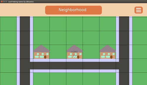
A few weeks ago I posted a screenshot of my current project on Twitter for #ScreenShotSaturday.
Here’s the image I used with lots and lots of placeholder art:
And I immediately got some great feedback on my user interface:
@GBGames and a hamburger menu! *sob*
— Dan MacDonald (@samuraidan) January 16, 2016
Wait, what’s a hamburger menu?
Oh.
Oh, that three-lines menu thing has a name? And it’s “hamburger menu?”
I guess that’s apt.
So I looked it up and found a few good articles about why hamburger menus are terrible and should not be used anymore.
Why and How to Avoid Hamburger Menus by Louie A. digs into the problems with this kind of menu, including how it has low discoverability, and provides some alternative solutions, which requires reviewing your information architecture to see what is most appropriate.
I’m not a UX person, but I had a human-computer interaction major as a roommate in college, so I’m at least familiar with some of the terms. There’s more research to do, clearly.
Brent Jackson’s An Update on the Hamburger Menu was written as a follow-up to an article in which he argues that the hamburger menu never seems to be a good solution. He points out that since his first article many major apps have removed it, and when a major organization added it to their website, they seemed to have found a need to not only label it with the text “MENU” but also to pop up a notification to let people know that it is, in fact, a menu button. Ick.
So, no, hamburger menus still don’t seem useful, and now people have done A/B tests and have some experimental data about how less useful they are.
Basically it comes down to interface design patterns. Patterns rely on familiarity and emerge slowly over time. Most of the ones we use on the web today have been around for many years.
Users have plenty of new things to learn without adding contrived navigation patterns into the mix. Let’s stop trying to innovate device-specific interactions and leave it to the device manufacturers.
I recall when I first encountered a hamburger menu.
I hated them.
I hated them for all the reasons Louie A. says in his article.
I think it was on some artist’s fancy website which was trying to be super minimalist (a trend I hate) while being well designed. I just wanted to know who the artist was. Where was the About page?
Eventually I noticed the three thin lines in the corner of the screen, but I remember thinking, “Is that a minimalistic logo of some kind?”
Eventually I realized those lines were clickable, and I clicked. OH! There’s the navigation bar!
…What the heck? How was I supposed to know that those three lines are supposed to equate to navigation?
Then it showed up in Firefox and Thunderbird. It was subtle. I didn’t know it existed until I couldn’t find a way to do a somewhat common task when sending an email. There used to be a button to click at the top of the browser window. A quick search online later, and I shook my fist at the screen again.
And then it started showing up elsewhere and seemingly everywhere, and I felt resigned to it.
I’m wondering why I decided to use it in my own game’s interface. Maybe I was thinking, “Well, the kids are doing it these days…” but that’s no excuse for thoughtlessly throwing stuff onto a screen that my players will need to interact with.
I plan to replace the hamburger icon with another one. I’ve seen games use a gear or tools icon, which might be more appropriate here.
Or maybe I’ll find that those are annoying and terrible, too.


3 replies on “Hamburger Menus Are Annoying and Terrible”
Haha, I never really though about this before. Actually after reading the tweet and what you had to say afterwords, I still wasn’t sure what you were talking about, it took me about 20 seconds to figure it out. Now I bet I’ll start noticing these all over the place. Starting with the top right of my google chrome browser just now. You’ve doomed me to notice something that before I would have always skimmed by without a second thought. Thanks for the Monday post.
I won’t mention the arrow in the FedEx logo then. B-)
Most of those studies are about 2 years old, and at the speed things change, I’d question their validity.
“Why and How to Avoid Hamburger Menus” has “Hamburger Menus” in the title, but the majority of the article seems to be railing against side-bar menus that slide in, not about the menu icon itself.
And “An Update on the Hamburger Menu” is an update to an article called “Why Not to Use Left Nav Flyouts”. So most of that argues that it’s not about changing the icon, it’s about rethinking the entire UI so “Left Nav Flyouts” aren’t needed.
They also seem focused on that menu being bad for general navigation through an app, which isn’t quite the same as it is for a “settings” menu (which I assume is what your menu does.
So while I’m not a fan of the hamburger menu, I’m unconvinced by these arguments.