Last week, I reported that I had fixed a number of defects and finished working with quantified items allowing the player to distribute snacks to other characters in The Dungeon Under My House, my non-violent, first-person role-playing game and my second Freshly Squeezed Entertainment project.
I needed to switch my efforts to supporting other projects but first I decided to tackle something that makes a substantial difference to the look and feel of the game.
Sprint 2024-31: UI – buttons
Planned and complete:
- Improve UI buttons shapes/images
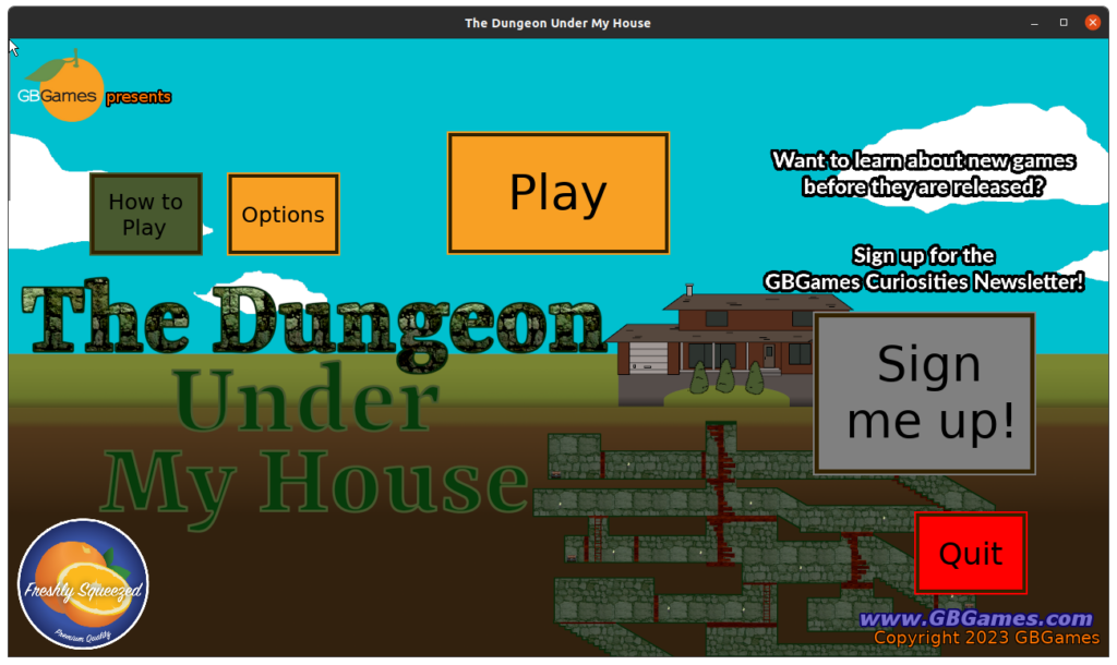
If you’ve been following along from the beginning, you know that I’ve had some placeholder buttons in place.
Here’s what it looked like last week, which is what it has looked like for months after I did a slight improvement by creating the outline, but I was never happy with it:
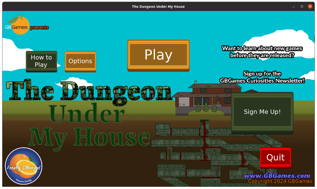
And here’s what it looks like today:
I decided to take advantage of the Kenney UI Pack, part of the many free assets created for game developers to use in their games. Why haven’t I been doing this sooner?
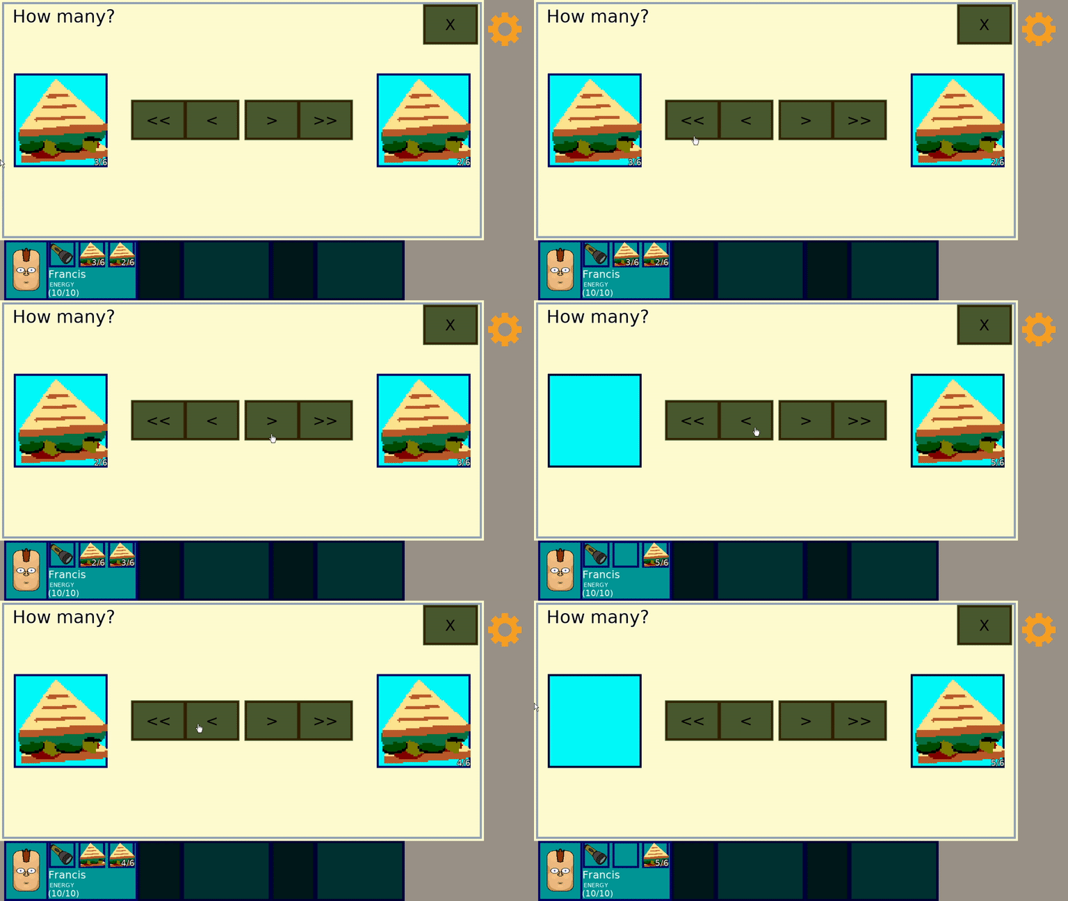
I took a button that I liked, modified it so that it can represent different button states, and now this lifeless interaction:
instead looks like this:
Seeing it in action really helps explain how much of an improvement this small change made.
I also realized that it would help to have fonts that contrast better with the button’s color, so I tweaked some of my UI helper code to allow me to specify the font color, and I think it is definitely better.
What do you think?
The GIF doesn’t seem to make it clear each time the button is pressed, but I think that’s more due to the frames being dropped because in-game it looks fine.
After this small yet impactful change, I started to work on my existing games. Basically, Apple requires new and updated apps to be built with Xcode 15 and use at least iOS SDK 17, and my current Mac Mini is too old to support the latest Mac OS which is why I can’t run Xcode 15.
So I signed up for Mac in Cloud which offers access to an M1-based Mac Mini and development environment that I can remote into, and it lets me pay for hours instead of days. That’s great, because as someone who works very, very part-time, who sometimes only works an hour a day on my projects, I don’t need to feel like I’m wasting my money.
Still, I do need to make sure that I make those hours count, so I’m currently updating my games to use the latest libSDL2 and related libraries. By and large it is straightforward and everything is compatible, but of course the main sticking point is that Apple has new requirements that the library might not yet support.
I’m still investigating, but I know a lot of effort is being put into libSDL3, so it isn’t clear to me yet if libSDL2 will be able to support the latest App Store requirements.
And I’ll see how complicated this work is and if I think it might be worth it going forward. My apps haven’t actually changed, yet I have to go through this effort just to keep them up in the App Store, and I’m not sure if it is worth it.
I’ve been paying ~$100/year for the privilege of being in the Apple Developer program, which allows me to publish to the App Store, but I am not making anywhere near that from the App Store, and unless my marketing efforts start to change the numbers substantially, I’m just paying to lose money, which makes this annual porting effort questionable as a business activity.
Thanks for reading!
—
Want to learn when I release The Dungeon Under My House, or about future Freshly Squeezed games I am creating? Sign up for the GBGames Curiosities newsletter, and download the full color Player’s Guides to my existing and future games for free!


2 replies on “Freshly Squeezed Progress Report: Improving the UI”
[…] Here’s the latest Freshly Squeezed Progress Report video, with footage covering the last couple of months of development, including this past week’s report: Improving the UI […]
[…] my last report, I updated the buttons to significantly improve the look and feel of The Dungeon Under My House, my […]