In last week’s report, I finally finished (haha) the main dialogue work for The Dungeon Under My House, my second Freshly Squeezed Entertainment project.
I had started replacing the temporary art of the house with less-temporary art, and I continued that work.
Sprint 43: Pre-production and initialization
Planned and incomplete:
- Create location art
Going from really simple temporary art to something more appropriate makes the game feel like it is becoming a living, breathing space rather than an abstraction.
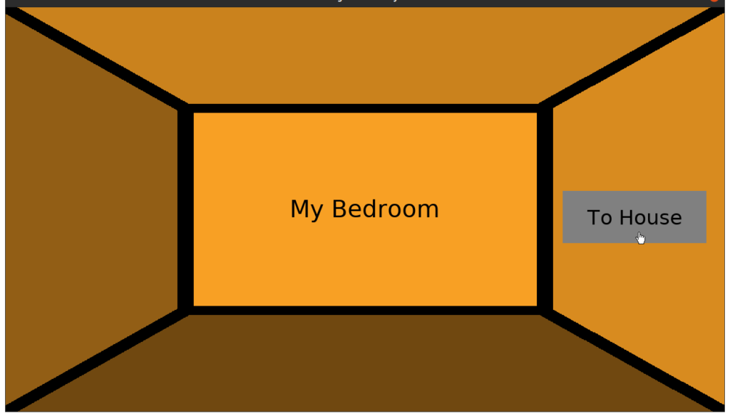
Here’s how the bedroom has looked ever since I started this project:
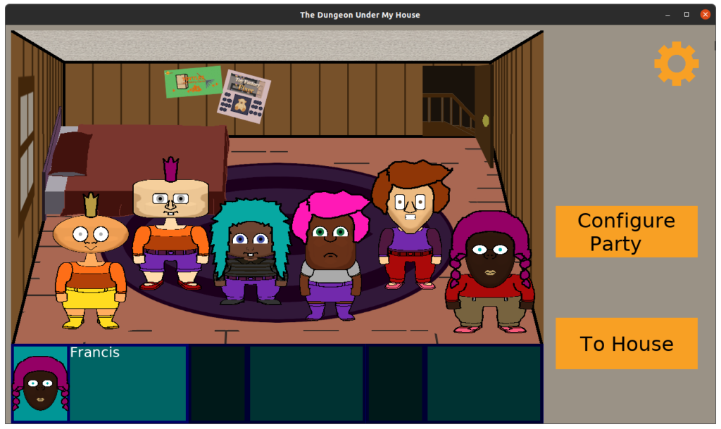
And here’s how it looks today:
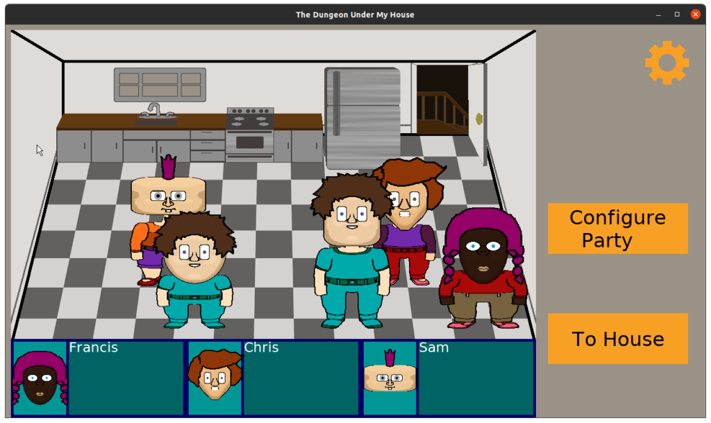
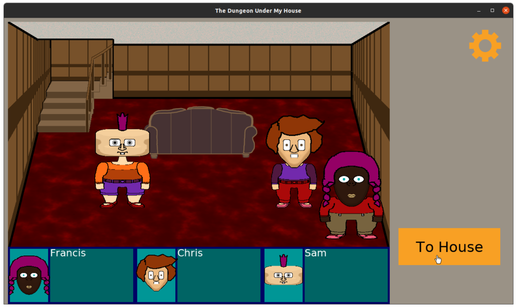
Other rooms are getting similar treatment.
Much of the work was spent fighting with the weird perspective I had created in the rooms of the house.
A flat rug on the floor or flat posters on the walls are pretty straightforward. As someone who isn’t an artist by trade but does decent programmer art, it wasn’t difficult to use the Gimp’s Perspective Tool to project things onto the floor or walls.
But I found three-dimensional objects were a bit more challenging.
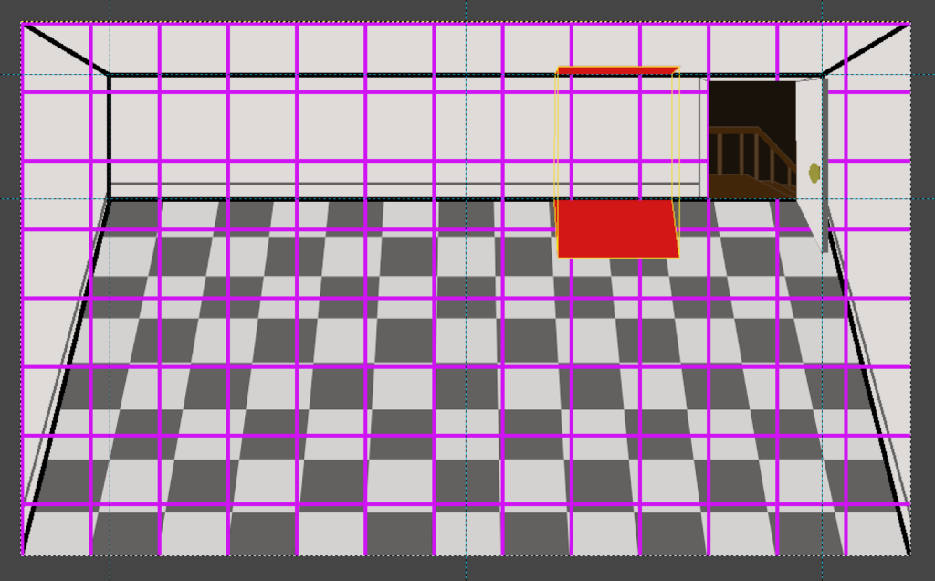
Here’s how I ended up solving it: I used Gimp to render a 2D grid, then copied it and used the Perspective Tool to project it onto the floor. Now, I can use the original grid to block out where the bed or the refrigerator would go on the floor, then do a similar projection onto the ceiling, then I would manually create a wireframe version of the object, connecting corners from the floor and ceiling.
Then I would draw over that wireframe, and this technique seemed to work, more or less.
The couch, on the other hand, did not get created the same way, and so it currently looks too flat and out of place. I think I can fix it, though.
And then I’ll need to finish the living room, create the bathroom and basement backgrounds, then add doors between the living room and the kitchen and the bathroom, and the house will be good enough for now.
Then I can make the doors and stairs into buttons, so that navigation within the house happens within the view of the house instead of using up space outside in the menus.
Now, I keep referring to this art as less-temporary, but that’s because I keep anticipating that all I’m doing is making the game look a little nicer for now while I still don’t know what I want in the rooms in the final game. When I originally envisioned the game, I wanted the player to be able to search the house to find supplies, such as eggs in the kitchen or towels in the now-non-existent hall closet, things that might help in any quests within the dungeon.
I still want the player to be able to do those things, and so doing this art work feels a bit premature. After all, what if I later design an item into the game and need to redo the layout of the house or make a room more obvious as a home for that item? I’m setting myself up for rework.
But maybe that kind of future rework is inevitable, and so my job as someone working on the game as it is today is to not spend too much time on things that might get replaced.
That’s why the rooms are currently a single image each. The objects in the rooms could have been separate sprites, but I can worry about separating them out when they become more permanent and perhaps interactable.
For now, the game just looks a little nicer in screenshots, and maybe that’s not a bad payoff for a few hours of investment.
Meanwhile, I’m aware that I’ve been working on this project since January, and it’s still in preproduction. I’m still figuring out what the game’s component parts will be, then I will start putting together the game itself in earnest.
So between working on it very, very part-time, not having well-defined scope, and entering into the holiday season when I’ll have even less time to dedicate to it, I’m pretty confident this project will not be published in 2023.
Putting my game producer hat on, I really want to ship this game sooner rather than later. I do not want to take 3 years to make one game, and so I’m already a little sad because it means a lot of my ideas won’t make it in, such as the rich and complex options for dialogue to help make the conversations a bit more compelling to participate in.
But I can remind myself that this game isn’t my last game. I can always build upon what I’ve created, adding more into a future project.
Thanks for reading!
—
Want to learn when I release The Dungeon Under My House, or about future Freshly Squeezed games I am creating? Sign up for the GBGames Curiosities newsletter, and download the full color Player’s Guides to my existing and future games for free!

One reply on “Freshly Squeezed Progress Report: Updating Temporary Background Art”
[…] week, I reported that I had started updating the temporary background art for the rooms of the house in The Dungeon […]