Last week, I reported that I had addressed a crash bug and then started the work of replacing the placeholder art for characters in The Dungeon Under My House, my second Freshly Squeezed Entertainment project.
I continued the work this past week.
Sprints 29: Pre-production and initialization
Planned and incomplete:
- Revise character customization
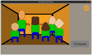
If you recall, I was tired of the placeholder art I was using to represent the characters in the game. Floating heads of various shapes were functional, but it was past time to make the characters resemble something more like what they will in the final version of the game.
At the very least, it would make the screenshots more compelling.
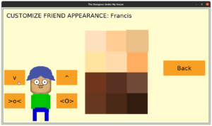
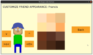
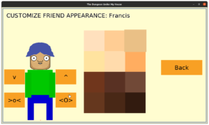
And the best way I thought to do this work was by creating character customization menus.
I decided to split up the customization categories into Body, Face, and Clothing.
On the Body customization screen, you can pick a skin color, and you can change the height and size of the character.
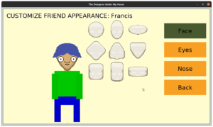
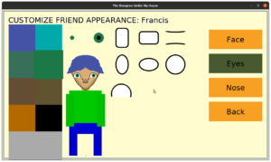
On the Face customization screen, you can change the base face shape and you can change the eyes and eye colors.
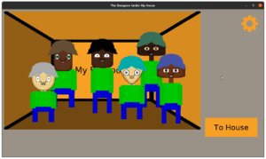
As I was ending the week, I threw in a single nose, mouth, and hair option, because otherwise it was creepy seeing the characters with unfinished faces.
I figured a terrible haircut would be better than nothing.
I’m relatively pleased with how these faces are turning out so far. I mean, I’m not going to pretend this isn’t still programmer art and that I still want better art, but it feels a lot more cartoony than what was there before. It’s becoming more real.
I find that I want to ensure the facial features have custom offsets on different faces. That is, a short and wide face might have the eyes offset farther away from the center than a tall and narrow face, and the nose might be lower or higher on a given face. I suppose I could let the player customize placement of features, but I could also keep it simpler for now.
This enhanced customization work means players can personalize the game more, and while I don’t anticipate having the capacity and ability to cover every possibility, I hope to provide a good variety to play with and to allow players to see themselves in their characters. And I can always improve it later.
Is there anything you wish character customization allowed you to do that you don’t usually see in other games? I’d love to hear from you in the comments section.
Thanks for reading!
—
Want to learn when I release The Dungeon Under My House, or about future Freshly Squeezed games I am creating? Sign up for the GBGames Curiosities newsletter, and download the full color Player’s Guides to my existing and future games for free!
