In last week’s report, I finished working on doors (for now) and got ladders into The Dungeon Under My House, my second Freshly Squeezed Entertainment project.
My intention for the next week was to make sure someone else can play the game, as it was a goal of mine for the quarter.
Sprints 24: Pre-production and initialization
Planned and complete:
- Create Android version
Unplanned and complete:
- Place family and friends in house
Unplanned and incomplete:
- Quit to main menu
Creating the Android version was a lot more straightforward than I anticipated, mainly because I have the build scripts and everything I need.
All I had to do was create an app icon.
It’s a temporary app icon, as eventually I want to get better, more permanent art into the game anyway, but I am wondering if there is a great icon for this game that isn’t a hallway or a door or the ladder.
Running the game on my Android phone, I found that the performance in the dungeon was not great. On the one hand, it worked. I could actually move about in the dungeon and my phone didn’t explode or burn up. But movement was a lot less smooth compared to my desktop.
I know my code wasn’t optimized, but I wonder if the issue is with the speed of the code or with the entire premise of raycasting as many columns as I have.
The final game might have a smaller viewport for the dungeon, which might make the game look a lot more blocky and pixellated than I want.
I didn’t end up sharing this version with anyone, but now I know that my game functions well enough on Android and can be easily built and shared going forward.
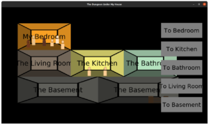
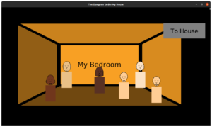
Next, I revisited the house. I wanted to get the Explorer’s Club and the parents into the game. While the dungeon is a 1st person view, the house is like a dollhouse seen from the side.
Eventually I want to replace this art, too, but I decided I needed to get the characters represented before I worry too much about how they look. So they have different faces over rectangle bodies, and they have different heights.
The Explorer’s Club is a group of kids who hunger for adventure in their sleepy suburban town, and I’m looking forward to exploring their world with them. I’ve written a bit of an intro to them, given them names and nicknames, and came up with the idea for their first quest: find some snacks.
By the end of the week, I found that I kept having to close the game and reopen it to start a new session so I can see my changes, and I decided that I needed to add a way to quit to the main menu from within the game, which required working on the in-game HUD a bit. Unfortunately, I ran out of time before I could do much, but after that task I’m looking forward to making it possible to interact with the Explorer’s Club in the coming week.
Thanks for reading!
—
Want to learn when I release The Dungeon Under My House, or about future Freshly Squeezed games I am creating? Sign up for the GBGames Curiosities newsletter, and download the full color Player’s Guides to my existing and future games for free!


One reply on “Freshly Squeezed Progress Report: Little People in the House”
[…] my previous report, I created an Android port with the intention of making it easier to hand someone a demo, then […]