
Last week, I reported that I was creating a house and basement, and I hinted at a location outside of the house in this Freshly Squeezed Entertainment project.
Since I officially announced that this project is called The Dungeon Under My House, I can now say that I’m building a dungeon. And yes, it will be under the house that I’ve created.
Sprint 8: Pre-production and initialization
Planned and complete:
- Create dungeon view with ladder back to basement
Unplanned and incomplete:
- Move player in dungeon view
The Dungeon Under My House is going to be a grid-based, 1st person role-playing game, and instead of working in 3D, I’m going to use 2D art simulating 3D much like games from the 80s and 90s.
Because I wanted to make things harder on myself apparently.
Unfortunately, I am not an artist by trade, and while my programmer art is decent enough for most of my purposes, I am already realizing that I have a lot more work than I initially thought.
In January, I made this sketch:
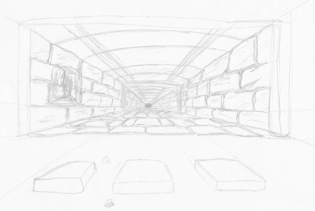
It was mainly to help me figure out what kind of art I would need to create.
Specifically, I wanted to have the ability to make each location in the grid look unique enough to be a mini-landmark. For instance, you might have a bunch of walls painted the same color in your home, but maybe the wall in your hallway has a pockmark, a nail hole, or even a drip of dried paint in a certain location that you would be able to recognize as belonging to that hallway’s wall.
Creating a single tile to be the floor wouldn’t get me there, and creating a handful of different tiles to add variety would only get me so far.
Instead, I want to create the floor out of a modular set of mini-tiles, so that I can mix and match. I could even render some of the mini-tiles at a slight angle to make them look like they are breaking up. Maybe it will work? I probably should do more mock-ups and tests.
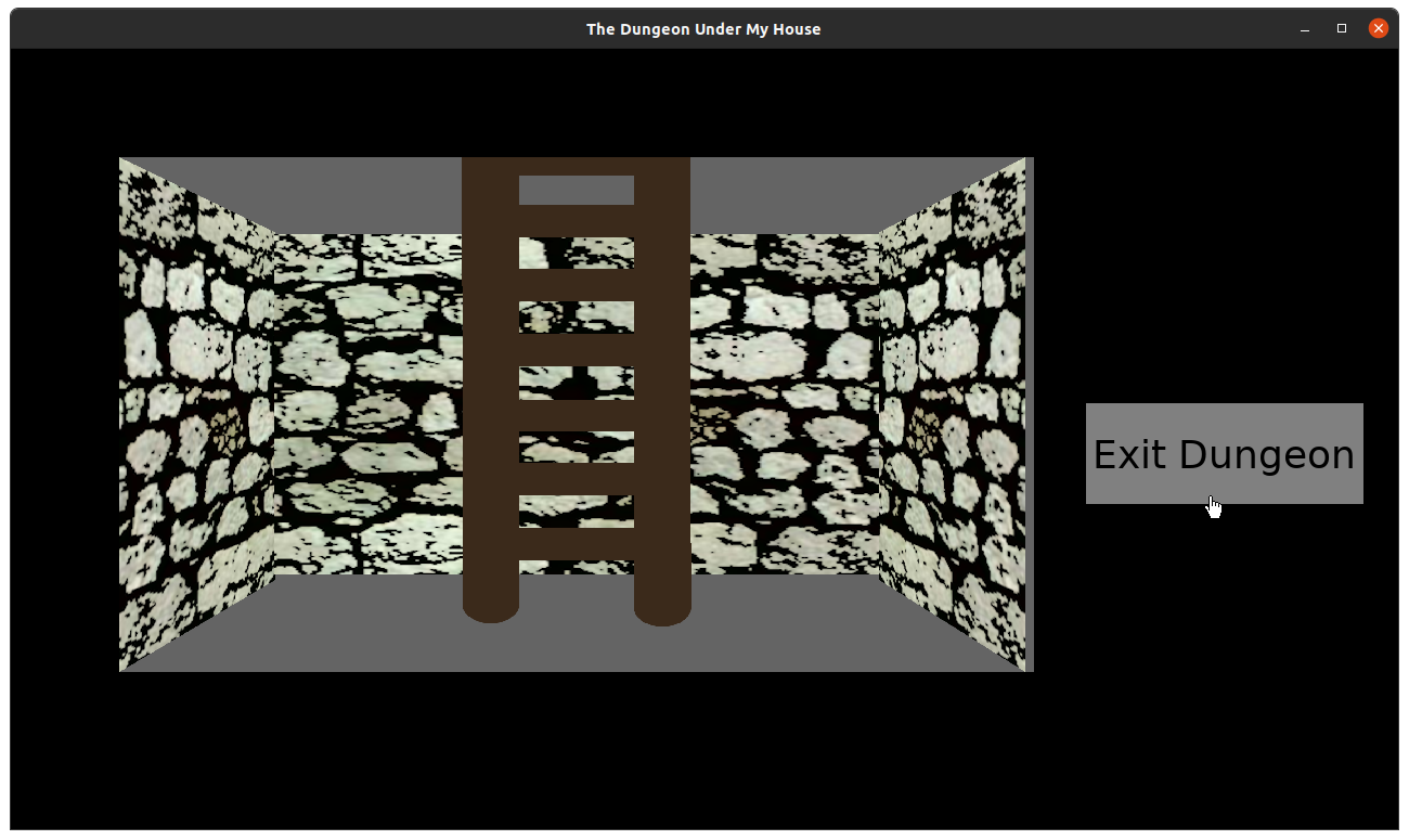
But for now, I needed to render a single location: the spot right under your basement. It needs three walls, a floor, a ladder, and a ceiling. I’ll worry about mini-tiles in the future.
If you recall from a few weeks ago in Freshly Squeezed Progress Report: Laying Down the Groundwork, I was toying around with Gimp’s Uniform Transform Tool to see if I could get a good sense of how the art needs to be laid out to make it look like it is vanishing into the distance.
It looked…OK?
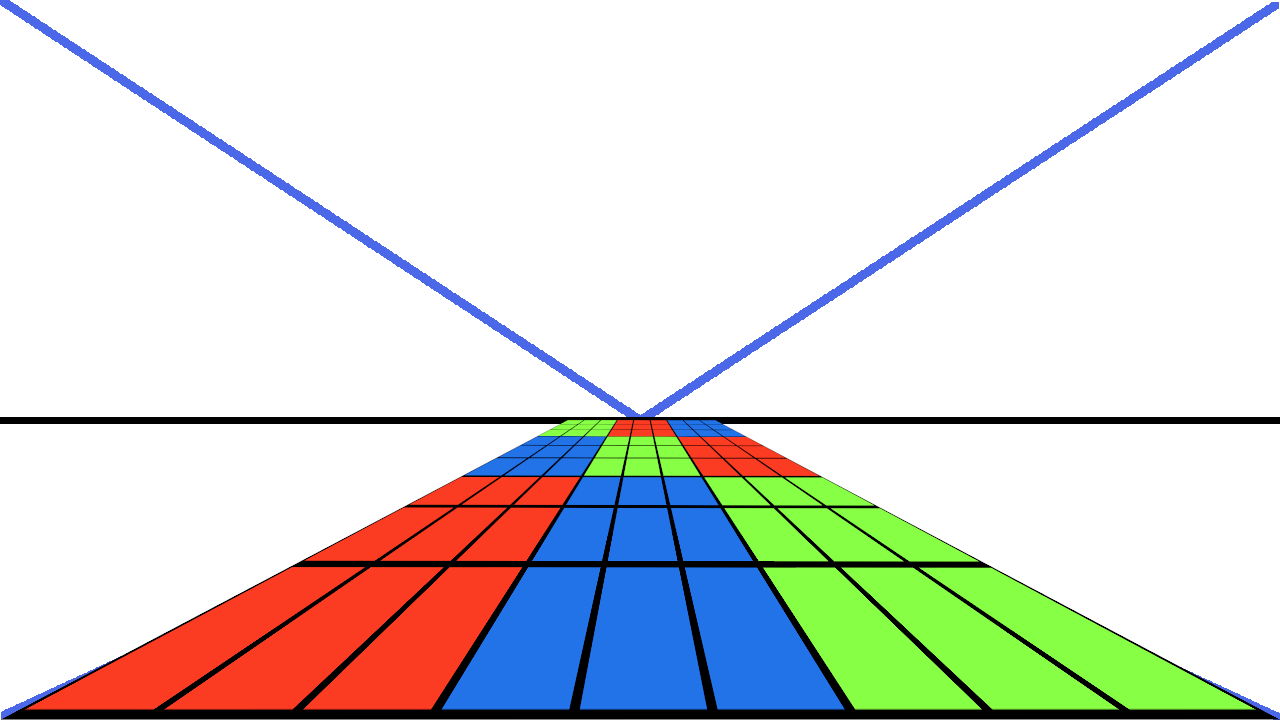
Well, now I needed to actually make something in game as opposed to mocked-up in an art program.
So I took a castle wall texture that I found on OpenGameArt, modified it slightly to give it a more sketched/cartoony look, and made a couple of skewed versions for the side walls. I made the ceiling a little shorter than the floor, mainly so that it wasn’t a boring perfectly centered horizon line.
And it looked fine except that things weren’t really lining up well when I coded something to render this art.
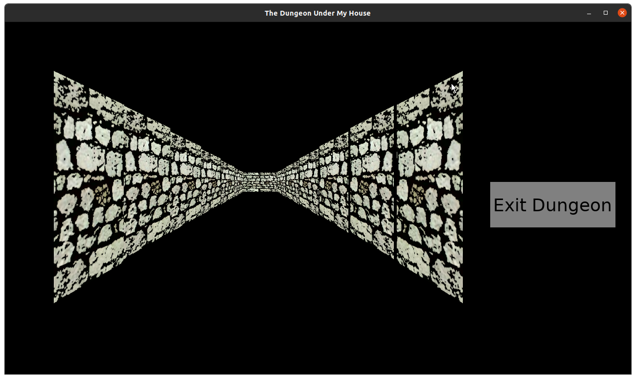
It was really obvious when I started trying to render a long hallway as an experiment, and I could see gaps between the walls as well as the fact that the walls didn’t line up at the top and bottom.
Basically, my math to figure out where to place the art wasn’t working, and it was breaking the illusion.
So I spent much of the last week figuring out the math for the placement of any particular wall segment based on the distance from the player’s viewpoint.
Skip ahead if you want to ignore the math.
The original wall art is 1024×1024. I created the side art at 256×1536. That is, the side wall is a quarter of the width and 1.5 times the height of the back wall.
With the back wall centered horizontally, that means that attaching the side walls on the left and right add another 50% of the width.
I want to be able to render the dungeon in an arbitrary viewport, something that could be potentially customized by the player. So I’m not hard-coding these dimensions, which is something I see in a lot of other games.
So, given an arbitrary viewport’s dimensions, I wanted the wall one tile away from you to be about 66% of the width and height of that viewport, and each time you see one more tile away it would be another 66% of the previous width and height.
The side walls would each take up about 16.67% of the viewport’s width, which totals up to about 33%. Intuitively, I had one-third for the side walls and two-thirds for the backwall, which should add up to three-thirds, or 100%, right?
And yet I was seeing vertical gaps where the tiles weren’t lining up horizontally. And it looked different depending on how the game’s window was shaped, since SDL2 was autoscaling much of what I was doing anyway. So sometimes there was a gap, and sometimes there wasn’t.
Was it rounding error? I’ve run into this kind of thing before in a previous project, when I discovered that the way I was rendering rectangular tiles for a game’s background meant that sometimes the rectangles had slightly different dimensions based on rounding errors. That is, a tile I expected to be 64×64 was sometimes 64×63. But I fixed that code years ago, and it wasn’t relevant here.
But the general concept seemed to be. 66% + 33% is actually only 99%, so maybe there was a 1% gap?
Eventually, I based the math on the actual relative dimensions of the art rather than the hypothetical numbers above. Plus, I used more precise numbers, like 0.666666667, which made things line up way better.
Plus, I found out that anti-aliasing introduced by the Uniform Transform Tool was producing slightly translucent pixels that meant my art itself had perceivable gaps, especially if I used a very bright color as a background.
So I remade some of the art and filled in all relevant translucent pixels, and it looked much better.
If you wanted to skip the math, you can continue reading here.
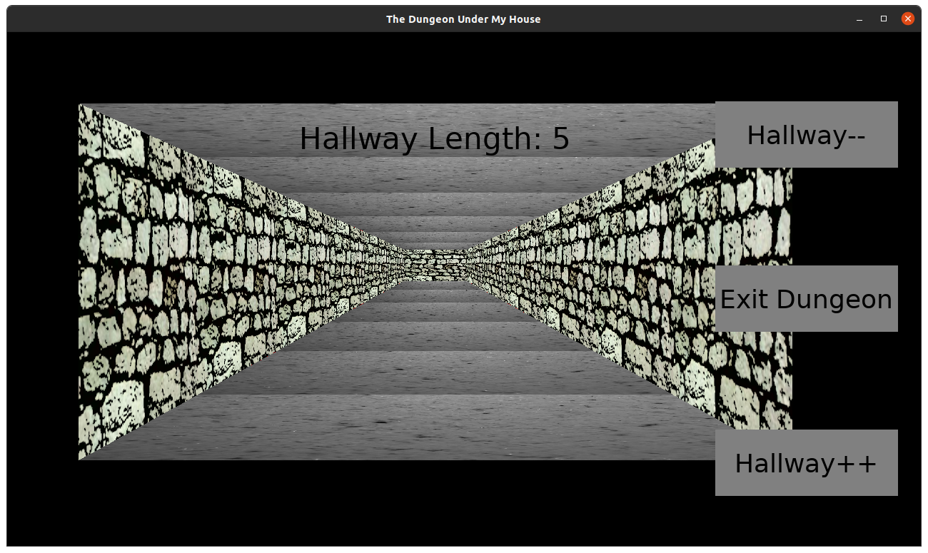
There are still gaps, especially at certain distances, but I have plans to address it, especially as I render more than a single hallway of tiles.
For the ceiling and floor, I used a picture I took in 2015 of the side of a glass I had a strawberry smoothie in. I turned it grayscale, skewed it, and it looks like a dirt/stone floor enough for now.
Next up, I wanted to make it possible to move the player within the dungeon, and so I spent time creating a way to represent the dungeon layout in code and a way to create those grid cells. I’m still working on it, but the dungeon is slowly coming to life. It may look a bit monotonous now, but it’s still a life.
Thanks for reading!
—
Want to learn when I release The Dungeon Under My House, or about future Freshly Squeezed games I am creating? Sign up for the GBGames Curiosities newsletter, and download the full color Player’s Guides to my existing and future games for free!
One reply on “Freshly Squeezed Progress Report: Dungeon Art and Math”
[…] last week’s report, I talked about the math and art of drawing the dungeon areas for The Dungeon Under My House, my […]