I’ve written in the past about designing games for color blind players because I believe accessibility is important. It doesn’t take too much effort, and a significant number of players will appreciate it.
Alan Zucconi wrote a multiple-page, interactive tutorial on making your game accessible to color blind players.
He provides a shader that simulates different types of blindness, such as Protanopia (red-green color blindness), in order to help a developer test a game to see how accessible it is.
While the download and tutorial itself is Unity-specific, he provides a good amount of background on the different types of color blindness. That information could be applied no matter what game development tools you use.
Even if you didn’t want to use the shader in question, the tutorial explains the theory behind it so you could always implement your own tool.
For example, I used SDL and a custom engine to create my casual strategy game Stop That Hero!, so adding shader support just to test colors seemed like a lot of work.
Instead, I took a screenshot and the RGB values Zucconi provided, then manually plugged those values into the Channel Mixer tool in GIMP to generate the following image:
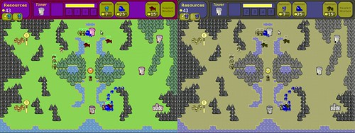
If you don’t have Protanopia, you can see the difference. The image on the right looks darker, and some of the colors aren’t discernible. I am pleased to see that my use of contrasting colors mostly worked, as the mountains and trees are easy to see compared to the ground.
On the other hand, key visual indicators are lost. My use of red to represent a depleted health bar is almost indistinguishable from the green part if you have red-green color blindness. Whoops. B-(
The images in Zucconi’s tutorial have a slider that lets you see how different kinds of color blindness may change how your game’s visual will be received. It’s amazing to see a gorgeous, colorful game like The Witness become washed out and almost monochromatic.
And for some people, it’s a permanent filter they can’t opt-out of, so if your game depends on color in order to play, you’ll want to make sure it doesn’t inadvertently leave these people out.